
Hi everyone, great to see you here!
This is my 5th blog on a series of data visualization with charts for specific purposes.
Sometimes, when doing data analysis, we want to have a comparison between 2 (or among some) objects on more than 1 criterion. For example, for the 4 seasons in a year, how are the temperature and humidity compared? In these cases, draw a plot should be a good choice.
For this purpose, we have:
First, let’s, as usual, import our beautiful libraries.
import numpy as np
import pandas as pd
import scipy as sp
import matplotlib
from matplotlib import pyplot as plt
import seaborn as sns
And we can (optionally) set some default parameters for our plots. I usually define the figure size and style as below.
# set default figure-size
matplotlib.rcParams['figure.figsize'] = (12, 8)
# set default style
plt.style.use('seaborn-darkgrid')
In case you want to select another style, you can see a list by running the below command.
print(plt.style.available)
To begin, we will create a data frame.
# create dataframe
data = pd.DataFrame({\
    'var1' : ['A', 'B', 'C', 'D', 'E'], \
    'var2' : [8, 5, 7, 4, 9], \
    'var3' : [9, 14, 12, 17, 13], \
    'var4' : ['X', 'Y', 'X', 'Y', 'X'], \
                    })

# show the data
print(data)
  var1  var2  var3 var4
0    A     8     9    X
1    B     5    14    Y
2    C     7    12    X
3    D     4    17    Y
4    E     9    13    X
Bar chart
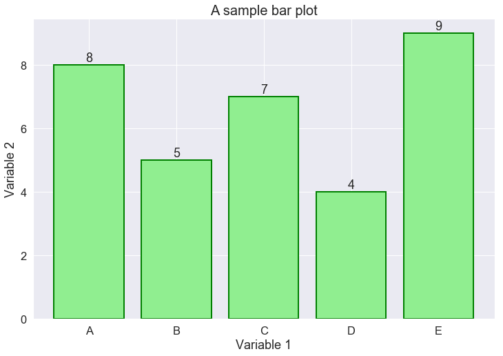
For the Bar chart, we use the classic matplotlib library.
In this example, we draw the values of column var2 for each object of var1. For illustration purposes, let’s suppose var1 stores the names of people, while var2 is their corresponding height. Hence, the following Bar chart shows the height of each person in our dataset.
# create a figure
fig, ax = plt.subplots()

# plot a bar-chart
ax.bar(range(len(data)), # x-axis positions
       data['var2'], # y-axis values
       color='lightgreen', # color of the bars
       edgecolor='green', # color of the bar edges
       linewidth=2, # thickness of the edges
       tick_label = data['var1'] # x-tickers
      )

# write the value above each bar
for i, value in enumerate(data['var2']):
    ax.text(i, # x-position of the text, which is bar-index
            value + 0.1, # y-position, just above the bar
            value, # value of the bar
            horizontalalignment='center', # align text
           )

# set title for the plot
ax.set_title('A sample bar plot', # title
             size=20, # title text-size
            )
ax.set_xlabel('Variable 1') # set label for x-axis
ax.set_ylabel('Variable 2') # set label for y-axis

# show the plot
plt.show()
It is quite simple, isn’t it?
Most of the code above is for aesthetic purposes, while the main code for drawing the bars occupies just several lines.
For more complex queries, like comparing objects on 2 criteria, Bar charts can also get the work done. However, it is worth noting that there is some manual work we have to do in order to make a grouped-bar-chart.
In particular, we have to set: a width for each bar, the space size between 2 bars, the positions where the bars are placed.
# create a figure
fig, ax = plt.subplots()

bar_width = 0.4 # width of each bar
space = 0.04 # space between 2 bars
position1 = [i for i in range(len(data))]
position2 = [pos + bar_width + space for pos in position1]

# plot the first bar-chart
ax.bar(position1, # x-axis positions
       data['var2'], # y-axis values
       color='lightgreen', # color of the bars
       tick_label=data['var1'], # x-tickers
       width=bar_width, # set bars' width
       label='Var2', # label of green bars
      )

# plot the second bar-chart
ax.bar(position2, # x-axis positions
       data['var3'], # y-axis values
       color='lightblue', # color of the bars
       width=bar_width, # set bars' width
       label='Var3' # label of blue bars
      )

# set title for the plot
ax.set_title('A sample bar plot', # title
             size=20, # title text-size
            )

# show legend
plt.legend()

# show the plot
plt.show()
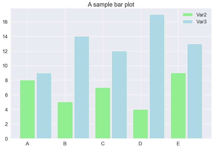
That is all with the Bar charts from Matplotlib.
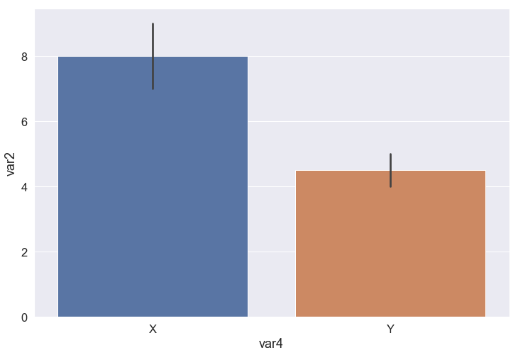
Seaborn, on the other hand, as being an enhanced version of Matplotlib, gives us an additional feature for the Bar chart, which is aggregating. A bar can represent not only a value but a list of values in terms of mean and standard deviation.
In the subsequent example, all the samples (rows) which have var4 equals X are grouped, taken the mean and std of var2 and drawn as the blue bar. The orange bar is made by the same process with var4 equals Y. The height of the bars depicts the mean, while the black line on the top of each bar indicates the standard deviation.
# plot an aggregating-bar-graph
ax = sns.barplot(data=data, x='var4', y='var2')

# show the plot
plt.show()
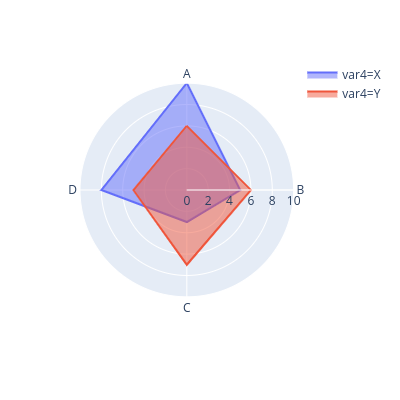
Radar chart
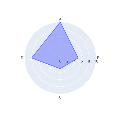
The radar chart, or Spider chart, is one of the fancy visualizations.
In the Radar chart, we start at the center of a polar axis. Each direction represents a criterion. The farther we go on a direction, the larger the value of that criterion the object has.
Unfortunately, our close friends Matplotlib and Seaborn do not support us in making Radar charts. Hence, we have to ask for it from another buddy, called Plotly.
Plotly is a versatile library for plotting, especially in the case of interactive plots. As its plots are very beautiful and interesting, I would highly encourage you guys to give a try!
from plotly.express import line_polar
To make a demo of the Radar chart would require a larger dataset, so let us re-create our data by adding some more values to it.
# create dataframe
data = pd.DataFrame({\
    'var1' : ['A', 'B', 'C', 'D', 'B', 'C', 'D', 'A'], \
    'var2' : [10, 6, 3, 5, 5, 7, 8, 6], \
    'var3' : [9, 14, 12, 17, 13, 7, 10, 9], \
    'var4' : ['X', 'Y', 'X', 'Y', 'X', 'Y', 'X', 'Y'], \
                    })

# sort our dataframe by var1
# to ensure the polygon we are going to draw is convex
data = data.sort_values(by=['var1'])
Now is the time to draw!
The syntax for calling the plot function is quite simple. With the comments attached to each line of code, the below snippet is supposedly self-explanatory.
fig = line_polar(data[data['var4'] == 'X'], # input dataframe
                 theta='var1', # the criteria
                 r='var2', # the magnitude of values
                 line_close=True, # the line is closed
                 width=400, # width of the figure
                 height=400 #height of the figure
                )
fig.update_traces(fill='toself') # fill the closed-line shape

# show the figure
fig.show()
Notice that we have a new parameter – color – here, which acts the same as hue on Seaborn.
from plotly.express import line_polar
fig = line_polar(data,  # input dataframe
                 theta='var1', # the criteria
                 r='var2', # the magnitude of values
                 color='var4', # rows with the same
                 # var4's values are draw together as a closed-line
                 line_close=True, # the line is closed
                 width=400, # width of the figure
                 height=400 #height of the figure
                )
fig.update_traces(fill='toself') # fill the closed-line shape

# show the figure
fig.show()
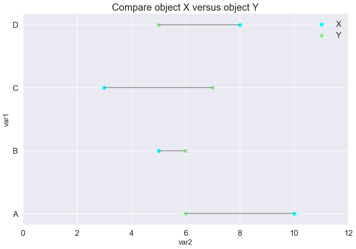
Lollipop plot
The third chart we are gonna see on this blog is the Lollipop plot.
This is a variant of the Scatter plot. The scatter-points of the same color belong to the same object and represent the magnitude of that object for a criterion. The difference in each criterion of 2 objects is depicted by a grey line. The longer the grey line, the larger the difference.
# number of criteria to compare
n_criteria = data['var1'].nunique()

# get separate dataframe for each object
X_data = data[data['var4'] == 'X']
Y_data = data[data['var4'] == 'Y']

# make a new figure
fig, ax = plt.subplots()

# draw scatter points of each object
ax.scatter(X_data['var2'], # x-axis, magnitude of values
           range(1, n_criteria+1), # y-axis, criteria
           color='cyan', # color of scatter-points
           s=50, # sizeo of scatter-points
           label='X' # this object is X
          )
ax.scatter(Y_data['var2'], # x-axis, magnitude of values
           range(1, n_criteria+1), # y-axis, criteria
           color='lightgreen', # color of scatter-points
           s=50, # sizeo of scatter-points
           label='Y' # this object is X
          )

# draw horizontal-lines connect the points
ax.hlines(y=range(1, n_criteria+1), # height of the line
          xmin=X_data['var2'], # endpoint of the lines
          xmax=Y_data['var2'], # endpoint of the lines
          color='grey' # color of the lines
         )

# set tickers for y-axis
ax.set_yticks(range(1, n_criteria+1))
ax.set_yticklabels(data['var1'].unique())

# set limit for x-axis
ax.set_xlim(0, 12)

# set title and x-label, y-label for the figure
ax.set_title('Compare object X versus object Y', size=20)
ax.set_xlabel('var2', size=15)
ax.set_ylabel('var1', size=15)

# show legend
plt.legend()

# show plot
plt.show()
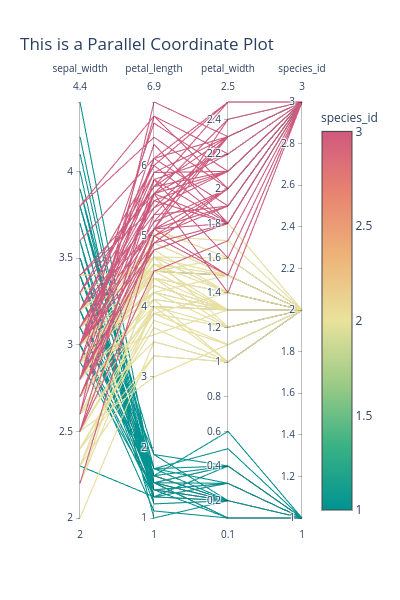
Parallel Coordinate plot
Notice that the above visualizations can hardly be used if the value ranges of the criteria are different, which is their big drawback.
To solve this co-ordinate scaling problem, a candidate is Parallel Coordinate Plot.
In this plot, each criterion (or co-ordinate) can have a different scale.
Each object is represented by a line, starting from the first and end at the last co-ordinate bar.
# import plotly and parallel_coordinates
import plotly.express as px
from plotly.express import parallel_coordinates

# load iris data
iris = px.data.iris()

# draw the plot
fig = parallel_coordinates(
    data_frame=iris, # data
    dimensions=['petal_width', 'petal_length', \
                'sepal_width','species_id'], # criteria
    color="species_id", # different species has different color
    color_continuous_scale=px.colors.diverging.Temps, # color pallete
    title="This is a Parallel Coordinate Plot", # title of the plot
    width=400, # width of the figure
    height=600 #height of the figure
                          )

# show the figure
fig.show()
On a side note, Plotly, compared to Matplotlib and Seaborn:
Conclusion
It is coming to the end!
In this blog, we exhibited 4 types of charts for the aim of comparing different objects on different criteria.
The bar chart is the most simple one, which is very popular in textbooks. It is easy to understand and very straightforward.
The Radar chart is attractive and fancy. However, we should use it with caution because it can mislead audiences about the main point. The audiences may have the wrong perception looking at its shape, its area and symmetricity, while these characteristics depend mostly on the order of the criteria, but not the values themselves.
The Lollipop plot is simple and elegant. A very strong point of the Lollipop is that it can work with a large number of criteria, but a weak point is that it would not perform well with many objects. In most cases, the Lollipop plot is good for 2 or 3 objects.
The Parallel Coordinate plot is quite different. It is able to support a very large number of objects, and a moderate number of criteria (from our experience, 5 or 7 criteria is still good). It has a scale for each criterion, which is a plus point over the preceding 3 charts. A downside is that it is a bit more complex, taking more time for the audience to grasp the sense of the data.
References: