
In this blog, we will cover:
QQ-plot
The confusion of Probability plot, QQ-plot, and PP-plot.
PP-plot
Conclusion
| Test your knowledge |
|
|
QQ-plot
High level speaking, QQ-plot (Quantile-Quantile plot) is a scatter plot, often be used to check if a variable follows the normal distribution (or any other distributions). If all points on the QQ-plot form (or almost form) a straight line, it is a high chance that the examining variable is normally distributed. On the other hand, if the points do not make it a straight line, the variable probably does not come from the normal distribution.
Let’s try an example.
I create 2 datasets, data1 and data2. While data1 is generated from sampling a normal distribution, data2 is from the uniform distribution. Then, I will draw 2 QQ-plots of these 2 datasets and you can compare the results.
# Import libraries
import numpy as np
from scipy import stats
import statsmodels.api as sm
import numpy.random as random
import matplotlib
import matplotlib.pyplot as plt
import seaborn as sns
# Define some characteristics of plots
matplotlib.rcParams['figure.figsize'] = (12, 8)
plt.style.use('seaborn-darkgrid')
# data1 is sampled from a normal distribution
#   with mu = 5, std = 2, size = 1000
data1 = random.normal(5, 2, 1000)
# data2 is sampled from an uniform distribution
#   with min = 1, max = 10, size = 1000
data2 = random.uniform(1, 10, 1000)
fig, ax = plt.subplots(2, 1, figsize=(8, 12))

sm.qqplot(data1, line='s', ax=ax[0])
ax[0].set_title('QQ plot for data1')

sm.qqplot(data2, line='s', ax=ax[1])
ax[1].set_title('QQ plot for data2')

plt.show()
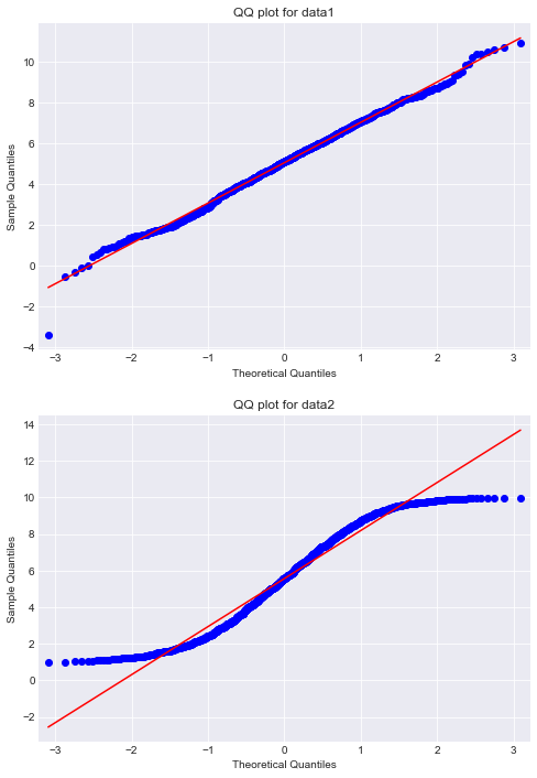
We can clearly see the difference!
Note:
 The red lines on the plots are the best-fit regression lines of the points.
The tickers on the x-axis and the y-axis can be safely ignored.
How to draw a QQ-plot?
I don’t think we can really understand how the QQ-plot works and why using it can help us see the normality of our data without knowing how exactly can we draw it.
In fact, drawing a QQ-plot is quite simple.
Let’s assume we have a data of n samples (a list of size n).
First, we sort the data.
Then, for each i-th value in our data (i goes from 1 to n):
   let x = data[i].
   let y = the value you expect when you sample n values from a normal distribution, sort them and take the i-th value (in other words, the i-th order statistics).
   draw a point at position (x, y).
As simple as that.
A difficulty here is: how to find y(s)? That is, how to find the expected i-th smallest number of a sample normal distribution with size n?
In the function we used above from the statsmodel, y(s) are computed using an involved estimation. To simplify this step, we can, instead, do an actual sampling of size n from a normal distribution, and then take the i-th smallest number as an estimate of the expected value.
Let me show my code:
def draw_QQ_plot(data, ax):
    # sort input data
    data.sort()

    # estimate a normal distribution
    norm = random.normal(0, 1, len(data))
    norm.sort()

    # draw the points
    ax.scatter(norm, data)

    # draw the best-fit line
    best_fit_line = np.polyfit(norm, data, 1)
    pl = np.poly1d(best_fit_line)

    ax.plot(norm, pl(norm), color='red')

    # set title and labels
    ax.set_title("QQ plot")
    ax.set_xlabel("Theoretical quantiles")
    ax.set_ylabel("Sample quantiles")

fig, ax = plt.subplots(2, 1, figsize=(8, 12))
draw_QQ_plot(data1, ax[0])
draw_QQ_plot(data2, ax[1])
plt.show()

As you can see, our function gives plots that are very similar to the ones given by statsmodels. The minor difference comes from the fact that we use a different estimation function (our estimation function is more simple). But, that doesn’t matter much, we still see that data1 fits very well to a straight line, while data2 does not.
A final note on this: Above, we showed how the QQ-plot can be used to test the normality of a dataset. QQ-plots are most often used for that purpose, but that’s not all that QQ-plots can do. In the next section, we will say more about this.
The confusion of Probability plot, QQ-plot, and PP-plot.
There is confusion about the Probability plot, QQ-plot, and PP-plot. In this blog, I will differentiate these 3 definitions.
First, I have to say, the confusion makes sense. While QQ-plot and PP-plot are well separated, the meaning behind the probability plot is sometimes obscure.
According to Wikipedia and most sources on the Internet, probability plot is a graphical technique, used to compare 2 datasets (each may be empirical or just theoretical), checking if they follow the same distribution or not. QQ-plot and PP-plot are just 2 different types of probability plots.
It is clear, isn’t it? But, actually, it is not. The same page on Wikipedia also says: The term “probability plot” may be used to refer to both of these types of plot, or the term “probability plot” may be used to refer specifically to a PP-plot.
Another fact is that scipy supports a function named “probplot”, which mainly acts as a QQ-plot.
Scipy probplot and Statsmodel QQ-plot
Before things get more complicated, let us move on to an example.
Below, I initialize a list of values, created by joining samples of 3 normal distributions, which have the same mean but different standard deviations. The aim is to have a dataset that follows a distribution somehow similar to the normal distribution, but actually not.
data = np.concatenate(
    (random.normal(100, 10, 1000),
     random.normal(100, 5, 1000),
     random.normal(100, 50, 1000))
                    )

sns.distplot(data)
plt.show()

Then, we will draw 2 probability plots.
One using Scipy‘s probplot, and the other from Statsmodels‘s QQ-plot.
fig, ax = plt.subplots(2, 1, figsize=(10, 16))

# draw using scipy's probplot
stats.probplot(data, plot=ax[0])

# draw using statsmodel's qqplot
sm.qqplot(data, line='r', ax=ax[1])

plt.show()
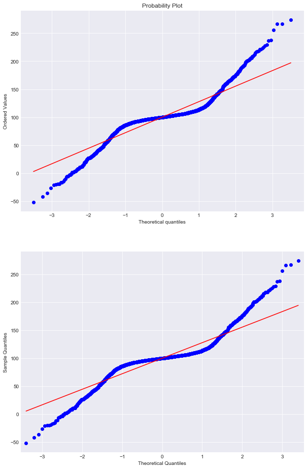
Parameter explanation:
In function qqplot, line=’r’ means to draw a regression line that fits the points.
Observation:
The 2 plots are identical. Except for some very minor differences in the aesthetic aspect, we can see that they show the same information. Hence, using either of the 2 just depends on your preference, they both give you a QQ-plot.
PP-plot
PP-plot (Probability-Probability plot) is another type of probability plot. It’s similar to the QQ-plot in terms of being a scatter plot and can be used to visually measure how a dataset and a distribution (or 2 datasets, or even 2 distributions) match each other.
In a PP-plot, we plot the 2 cumulative distribution functions (CDF) against each other. For example, assume we want to check if a dataset follows the normal distribution, we take x as the array of CDF values of a unit normal distribution, and y as the array of estimated CDF of our datasets, then draw a scatter plot with these x-array and y-array. As CDF values are in the range [0, 1], our dataset matches normal distribution if and only if the scatter points form a line that overlap (or almost overlap) with the straight line goes from (0, 0) to (1, 1).
A PP-plot can be plotted as below:
# take a sample of normal distribution
norm = random.normal(0, 1, len(data))
# scale the norm, so that it has the same
#   min and max values as the data
norm = norm - (min(norm) - min(data))
min_value = min(norm)
scale = (max(data) - min_value) / (max(norm) - min_value)
norm = np.apply_along_axis(lambda x : min_value + (x-min_value)*scale, axis=0, arr=norm)

# sort norm and data
norm.sort()
data.sort()

# calculate the cumulative distribution functions
bins = np.percentile(norm, np.linspace(0, 100, 1000))
data_hist, _ = np.histogram(data, bins=bins)
cumsum_data = np.cumsum(data_hist)
cumsum_data = np.array(cumsum_data) / max(cumsum_data)

norm_hist, _ = np.histogram(norm, bins=bins)
cumsum_norm = np.cumsum(norm_hist)
cumsum_norm = np.array(cumsum_norm) / max(cumsum_norm)

# draw the PP plot
fig, ax = plt.subplots()
ax.plot(cumsum_norm, cumsum_data, 'o')
ax.plot([0, 1], [0, 1], color='r')
plt.show()

That’s it! We draw a PP-plot ourselves.
As the points on the plot don’t seem to stick with the 45-degree line, we can say that the data is not normally distributed.
| Test your understanding |
|
|
Conclusion
Above, we learned about the Probability plot, QQ-plot, and PP-plot.
The probability plot is a technique to visually compare the distribution of 2 datasets (each dataset may be theoretical or empirical, but most common is 1 empirical vs 1 theoretical dataset).
QQ-plot and PP-plot are 2 branches of Probability plot (but be cautious, some literature mix them up).
QQ-plot deals with probability density function, while the PP-plot deals with cumulative density function.
Based on their nature, the QQ-plot has a higher deviation at 2 tails (i.e. QQ-plot has fewer points at the 2 tails), while for PP-plot, the deviation is higher in the middle. And as researchers often give more attention to the tails, the QQ-plot is more popular in practice.
To draw a QQ-plot, we can use either probplot from scipy.stats or qqplot from statsmodel, as they produce comparable results.
References:
QQ-plot could give us a quick visualization about normality of given samples. It would be very appreciated if author would expand the topic a little bit by the following directions:
1. Other method to check normality of a sample. Is there a score to measure than just a plot to visualize?
2. QQ-plot with other distributions than normal one, e.g. uniform distribution, chisquare, etc…
Thanks for a great writing,
Regard,
Truong Dang.
Thank you for your suggestions!
Those parts will be added soon.
To my knowledge, there are some quantitative measurements to filter out those that are not normal. However, there is still no reliable metric that can say: Yes, this data sample follows a normal distribution.
Bests,