
Matplotlib is undeniably the most prevalent name in the family of visualization libraries in Python. In this blog post, we are going to make a head-first start with this beloved collection of graphs and plots.
For the purpose of introduction, we will have a short journey with the common charts:
with the help of the 2 datasets:
Firstly, let’s import pyplot from matplotlib:
import matplotlib.pyplot as plt
and load the 2 datasets:
from sklearn import datasets
import pandas as pd
import numpy as np

# iris
iris = datasets.load_iris()
iris_df = pd.DataFrame(iris.data, columns=iris.feature_names)
iris_df['iris-type'] = iris.target
iris_df['iris-type'] = iris_df['iris-type'].apply(lambda i : iris.target_names[i])

print ('shape of iris dataframe: {}'.format(iris_df.shape))
print(iris_df.head())


# boston
from sklearn.datasets import load_boston
boston = load_boston()
boston_df = pd.DataFrame(boston.data, columns=boston.feature_names)
boston_df['MEDV'] = boston.target

print ('shape of boston dataframe: {}'.format(boston_df.shape))
print(boston_df.head())
shape of iris dataframe: (150, 5)
   sepal length (cm)  sepal width (cm)  petal length (cm)  petal width (cm) iris-type
0                5.1               3.5                1.4               0.2    setosa
1                4.9               3.0                1.4               0.2    setosa
2                4.7               3.2                1.3               0.2    setosa
3                4.6               3.1                1.5               0.2    setosa
4                5.0               3.6                1.4               0.2    setosa
shape of boston dataframe: (506, 14)
      CRIM    ZN  INDUS  CHAS    NOX     RM   AGE     DIS  RAD    TAX  PTRATIO       B  LSTAT  MEDV
0  0.00632  18.0   2.31   0.0  0.538  6.575  65.2  4.0900  1.0  296.0     15.3  396.90   4.98  24.0
1  0.02731   0.0   7.07   0.0  0.469  6.421  78.9  4.9671  2.0  242.0     17.8  396.90   9.14  21.6
2  0.02729   0.0   7.07   0.0  0.469  7.185  61.1  4.9671  2.0  242.0     17.8  392.83   4.03  34.7
3  0.03237   0.0   2.18   0.0  0.458  6.998  45.8  6.0622  3.0  222.0     18.7  394.63   2.94  33.4
4  0.06905   0.0   2.18   0.0  0.458  7.147  54.2  6.0622  3.0  222.0     18.7  396.90   5.33  36.2
Before moving on, let us have a short introduction to these 2 datasets.
Iris
Iris is a small dataset with 150 samples, 4 predictor variables, and a classification target. The intention of this dataset is to predict the type of iris flower (target variable) using the characteristics of its sepal and petal (4 predictors).
The variable names do a good job of explaining themselves, so we don’t need any further description.
Boston House Price
Boston dataset’s intention is to predict the median house price of a location (inside Boston), given various characteristics of that location. It has 13 predictor variables and a regression target.
Here is the description of the variables:
| CRIM | per capita crime rate by town |
| ZN | the proportion of residential land zoned for lots over 25,000 sq.ft. |
| INDUS | proportion of non-retail business acres per town |
| CHAS | Charles River dummy variable (= 1 if tract bounds river; 0 otherwise) |
| NOX | nitric oxides concentration (parts per 10 million) |
| RM | the average number of rooms per dwelling |
| AGE | proportion of owner-occupied units built prior to 1940 |
| DIS | weighted distances to five Boston employment centers |
| RAD | index of accessibility to radial highways |
| TAX | full-value property-tax rate per $10,000 |
| PTRATIO | pupil-teacher ratio by town |
| B | 1000(Bk – 0.63)^2 where Bk is the proportion of blacks by town |
| LSTAT | % lower status of the population |
| MEDV | The median value of owner-occupied homes in $1000’s |
In Python, you can do “print (iris)” and “print (boston)” to see more details about these data.
Scatter plot
fig, ax = plt.subplots()
ax.scatter(iris_df['iris-type'], iris_df['sepal length (cm)'])
ax.set_title('The distribution of sepal length over different Iris-types')
ax.set_xticks(range(0, 3))
ax.set_xticklabels(iris.target_names)
ax.set_ylabel('sepal length (cm)')
ax.set_xlabel('type')
plt.show()
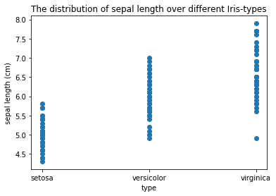
The Scatter Plot is a very useful tool to visualize data.
Above, we just use it to see the effect of sepal length to the target type. That is, we used it to visualize the effect of 1 variable to another variable.
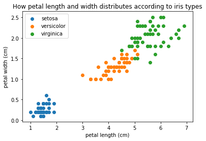
In fact, scatter plots are more powerful than that. They support checking the effect of 2 variables to 1 other variable. As in the plot below:
df_setosa = iris_df[iris_df['iris-type'] == 'setosa']
df_versicolor = iris_df[iris_df['iris-type'] == 'versicolor']
df_virginica = iris_df[iris_df['iris-type'] == 'virginica']

fig, ax = plt.subplots()
ax.scatter(df_setosa['petal length (cm)'], df_setosa['petal width (cm)'], label='setosa')
ax.scatter(df_versicolor['petal length (cm)'], df_versicolor['petal width (cm)'], label='versicolor')
ax.scatter(df_virginica['petal length (cm)'], df_virginica['petal width (cm)'], label='virginica')
ax.set_title('How petal length and width distributes according to iris types')
ax.set_xlabel('petal length (cm)')
ax.set_ylabel('petal width (cm)')
ax.legend()
plt.show()
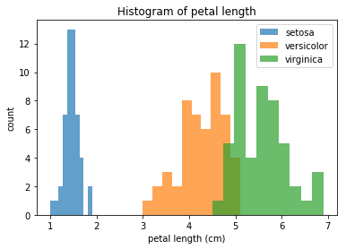
Histogram
A Histogram shows us the distribution of a variable.
However, we can use the same trick as in the scatter plot to extend it to 2 variables. The trick is to split the data frame into sub-data-frames, then draw all these sub-data-frames with different colors.
fig, ax = plt.subplots()
ax.hist(df_setosa['petal length (cm)'], alpha=0.7, label='setosa')
ax.hist(df_versicolor['petal length (cm)'], alpha=0.7, label='versicolor')
ax.hist(df_virginica['petal length (cm)'], alpha=0.7, label='virginica')
ax.set_title('Histogram of petal length')
ax.set_xlabel('petal length (cm)')
ax.set_ylabel('count')
ax.legend()
plt.show()
Line plot
Line plots are best used for time-series (or related to time-series) data. They can help us capture the change of a variable over time.
Unfortunately, we don’t have a dataset with time-series here. But what we are doing is just for demonstration, so let’s just focus on the code and the way to use Line plot, instead of judging if using a line plot in this example is optimal or not.
Let’s switch to the Boston dataset. We will be drawing a line plot on the median price of the houses.
fig, ax = plt.subplots()
ax.plot(sorted(boston_df['MEDV']), color='green')
ax.set_title('Median House Price in different place of Boston')
ax.set_ylabel('Price ($1000)')
ax.set_xlabel('House index')
plt.show()

From the plot, we can see a break-point at the price of about 25000 dollars. House price increases steeply after this point. Seemingly, the houses that are less than 25000 dollars are for average people, while above 25000 are for the rich ones.
Horizontal bar-chart
A feature that caught my attention was RM – which indicates the average number of rooms. This seems to be a very strong predictor because it is related to the area of the house, and the house’s price, as in my experience, depends quite a lot on the area. Let’s draw a horizontal bar chart to see if it is right!
boston_df['RM_rounded'] = boston_df['RM'].round() # we round RM to integer
MEDV_by_RM = boston_df.groupby('RM_rounded')['MEDV'].median() # and take the median house price of each RM_rounded

fig, ax = plt.subplots()
ax.barh(MEDV_by_RM.index, MEDV_by_RM)
ax.set_title('House price by Number of rooms')
ax.set_xlabel('Median House price ($1000)')
ax.set_ylabel('Rounded median number of rooms')
plt.show()

Endnote
The above are 4 of the common charts that are often used in practice. Admittedly, the charts we drew up there were not so attractive, however, as this is our first time using Matplotlib, we shouldn’t have a too high expectation, should we?
In the next blog posts, we will have a series of charts for some specific purposes. Those latter charts, hopefully, will have a better look than the ones we have today.
Happy learning!
References:
- Matplotlib official site: link