
Hi everyone,
This is my first blog on a series of data visualization with charts for specific purposes.
In this blog, we will examine a use-case when we want to inspect the proportion of one (or more variables). Often, the sum of all values is considered 100% and we want to know how much of a share each value represents, over the total 100%.
The plots we will be using in this post are:
First, let’s, as usual, import our beautiful libraries.
import numpy as np
import pandas as pd
import scipy as sp
import matplotlib
from matplotlib import pyplot as plt
import seaborn as sns
And we can (optionally) set some default parameters for our plots. I usually define the figure size and style as below.
# set default figure-size
matplotlib.rcParams['figure.figsize'] = (12, 8)
# set default style
plt.style.use('seaborn-darkgrid')
In case you want to select another style, you can see a list by running the below command.
print(plt.style.available)
Pie Chart
# Data to plot
companies = ['Apple', 'Disney', 'Amazon', 'Facebook']
values = [153.6, 52.2, 187.9, 88.9]

# Customization
colors = ['lightskyblue', 'mediumorchid', 'palegreen', 'lightcoral']
explode = [0.02, 0.1, 0.02, 0.02]

# draw pie chart
fig, ax = plt.subplots()
ax.pie(values, labels=companies, colors=colors, \
       explode=explode, autopct='%1.1f%%', \
      shadow=True, textprops={'fontsize' : 14}, \
      wedgeprops={'edgecolor': 'w', 'linewidth': 1})

plt.axis('equal')
plt.show()
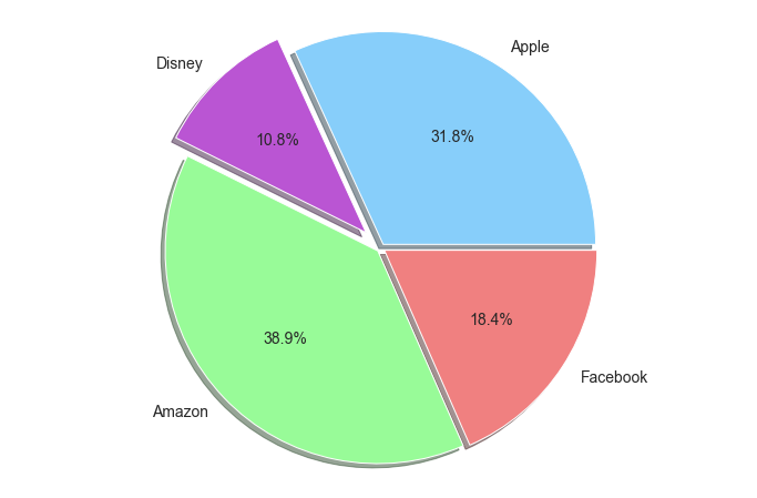
We can change the parameters to see the effects, here is a quick summary:
- colors: The color of each slice, respectively.
- explode: How much each slice is distanced from the origin.
- autopct: The format of the percentages shown in the chart.
- shadow: show/not show the shadow of each slice.
- textprops: configuration of text in the chart.
- wedgeprops: wedge’s properties. I use it to set stroke color and size.
- plt.axis(‘equal’): to make the chart appear in the center of the page.
Stacked Bar Chart
# Data to plot
values = {
    'dog' : [12, 5, 7 , 8],
    'cat' : [7, 11, 8, 6],
    'tiger' : [6, 2, 1, 3]
}

criteria = ['Helpfulness', 'Cuteness', 'Cheapness', 'Easy-to-raise']

# Color
color = ['paleturquoise', 'aquamarine', 'salmon']

# Make percentage values
zipped_values = list(zip(*list(values.values())))
totals = [sum(each) for each in zipped_values]
values_pct = {}
for key in values:
    values_pct[key] = np.array(values[key]) / np.array(totals)

# Make figure and draw
fig, ax = plt.subplots()

bottom = np.zeros(len(criteria)) # retrive cumulative sum of values
for idx, key in enumerate(values_pct):
    ax.bar(criteria, values_pct[key], \
           bottom=bottom, label=key, \
           color=color[idx], edgecolor='w')

    for i, v in enumerate(values_pct[key]):
        ax.text(i, bottom[i]+v/2, '{:.1f}%'.format(v*100), \
                horizontalalignment='center')

    bottom += np.array(values_pct[key])


ax.set_title('Traits of your pets', fontsize=25, y=1.05)
ax.set_xticks(range(len(criteria)))
ax.set_xticklabels(criteria, fontsize=16)
ax.set_ylim(0, 1)
plt.legend(fontsize=16, bbox_to_anchor=(1, 1))
plt.show()
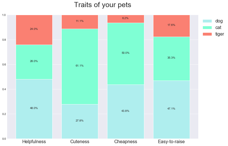
This is a little bit more involved than the Pie chart.
We need to change the absolute values to percentages, then set the bottom of the stacked bars by ourselves.
Parameter explanation:
- totals: the sum of values for each criterion.
- values_pct: the original values transformed into percentages.
- bottom: stores the cumulative sum of values, to determine the bottom of each bar.
- edgecolor: the color of bars’ borders.
- ax.text(…): add text (in this case, the percentages) to chart.
- bbox_to_anchor: to set the position of the legend table.
References: