
Hi everyone, this is my 2nd blog on a series of data visualization with charts for specific purposes.
This time, we are going to examine the distribution of the data. The charts suitable for this goal are:
First, let’s, as usual, import our beautiful libraries.
import numpy as np
import pandas as pd
import scipy as sp
import matplotlib
from matplotlib import pyplot as plt
import seaborn as sns
And we can (optionally) set some default parameters for our plots. I usually define the figure size and style as below.
# set default figure-size
matplotlib.rcParams['figure.figsize'] = (12, 8)
# set default style
plt.style.use('seaborn-darkgrid')
In case you want to select another style, you can see a list by running the below command.
print(plt.style.available)
Histogram
The histogram is used very frequently.
It puts our data to bins and then draws a bar-graph of the count of those bins. It also supports drawing counts in the form of density. That is, each count is divided by the total number before plotting.
# Data to plot
values = np.random.normal(0, 1, 1000)

# Draw a histogram
fig, ax = plt.subplots()
sns.distplot(values, hist=True)

# Draw a normal distribution curve
mu, sigma = sp.stats.norm.fit(values)
x_line = np.linspace(min(values), max(values), 1000)
y_line = sp.stats.norm.pdf(x_line, mu, sigma)

ax.plot(x_line, y_line, color='lightblue')
plt.show()
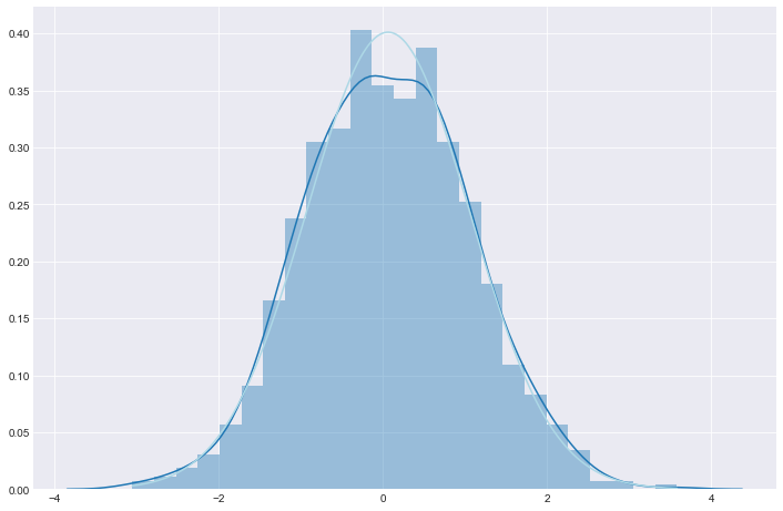
In the figure above, aside from the histogram, we also draw 2 lines:
By comparing the 2 lines (by compare, I mean to check if the 2 lines coincide), we can verify how likely that our data follows a normal distribution. In this example, we can see that our 2 lines highly match each other, suggesting that our data seems to be nearly normally distributed.
Box-plot
Box-plot is quite a versatile plot. We often use box-plots to inspect the distribution of the data and to detect outliers.
Seaborn does a really good job of innovating box-plot. It is not just more handsome but also supports more functions than in the original version from matplotlib.
In the below code, we create a data frame that has 3 numerical columns and 2 categorical columns. Then, we draw a box-plot for all the numerical columns.
# Data to plot
data = pd.DataFrame({\
    'Var1' : np.random.normal(5, 5, 1000), \
    'Var2' : np.random.normal(7, 3, 1000), \
    'Var3' : np.random.normal(9, 7, 1000), \
    'Var4' : np.random.choice(['A', 'B', 'C', 'D'], size=1000, replace=True), \
    'Var5' : np.random.choice(['X', 'Y'], size=1000, replace=True)
                    })

# Draw box-plot
fig, ax = plt.subplots()
ax = sns.boxplot(data=data, whis=1.5)
ax.set_title('This is a box-plot', fontsize=20)

plt.show()
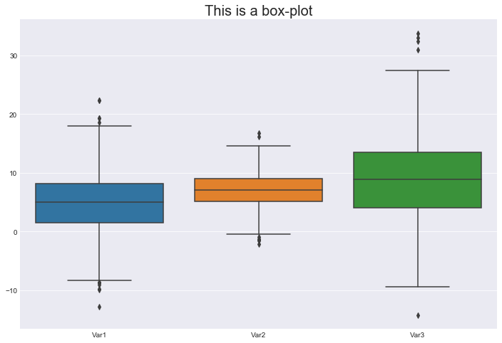
We have 3 boxes, those are the blue, orange and green boxes. Each of them represents a variable.
For each box:

Here we go to a little bit more complex box-plot:
# Draw box-plot
fig, ax = plt.subplots()
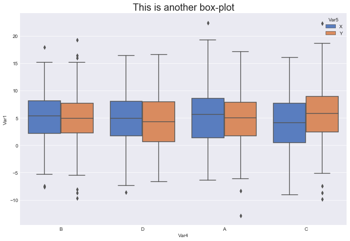
ax = sns.boxplot(data=data, x='Var4', \
y='Var1', hue='Var5', \
palette=sns.color_palette('muted'))
ax.set_title('This is another box-plot', fontsize=20)
plt.show()
What do we have here?
Now we don’t plot all the numerical rows anymore. We are only plotting values from the column Var1, but those values are separated over Var4 and Var5.
The x-axis represents the values of Var4, while the colors (blue and orange) represent the values of Var5. This multi-box-plot helps us not only see the distribution of the values but also compare the values when they fall into different categories.
Violin-plot
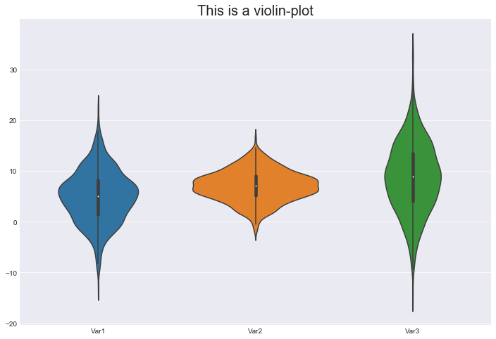
Violin-plot is very similar to box-plot. It has every information box-plot has (because, actually, it contains a box-plot inside), along with some new pros:
So does that mean the Violin-plot can take over Box-plot?
Not yet, as violin also has some cons:
# Draw a violin-plot
fig, ax = plt.subplots()
ax = sns.violinplot(data=data)
ax.set_title('This is a violin-plot', fontsize=20)

plt.show()
Notes:
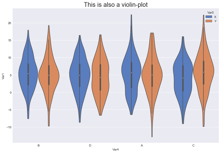
And here is a multi-violin-plot, which is equivalent to the multi-box-plot above.
# Draw a violin-plot
fig, ax = plt.subplots()
sns.violinplot(data=data, x='Var4', \
               y='Var1', hue='Var5', \
               cut=0, \
               palette=sns.color_palette('muted'))

ax.set_title('This is also a violin-plot', fontsize=20)

plt.show()
References: