
Hi everybody,
This is my 3rd blog on a series of data visualization with charts for specific purposes. This time, it’s about showing the trending aspect of the variables. I hope you enjoy this!
The charts for today are:
First, let’s, as usual, import our beautiful libraries.
import numpy as np
import pandas as pd
import scipy as sp
import matplotlib
from matplotlib import pyplot as plt
import seaborn as sns
And we can (optionally) set some default parameters for our plots. I usually define the figure size and style as below.
# set default figure-size
matplotlib.rcParams['figure.figsize'] = (12, 8)
# set default style
plt.style.use('seaborn-darkgrid')
In case you want to select another style, you can see a list by running the below command.
print(plt.style.available)
Line Plot
Seaborn’s Line Plots are integrated with quite a lot of useful functions.
When talking about a Line Plot, many (including myself) would think about just a line with sequential ups and downs. Yes, that’s a Line Plot, but we can utilize them further.
Let us draw 4 Line Plots first, the explanation will come afterward.
# set bigger font size
sns.set(font_scale=2)

fig, ax = plt.subplots(4, figsize=(12, 32))

# Line-plot at position [0]
data = [1, 5, 2, 8, 3, 7]
x_values = [1, 2, 3, 4, 5, 6]

sns.lineplot(x=x_values, y=data, ax=ax[0])

# Line-plot at position [1]
data = [1, 5, 2, 8, 3, 7]
x_values = [3, 1, 6, 5, 2, 4]

sns.lineplot(x=x_values, y=data, ax=ax[1])


# Line-plot at position [2]
data = [1, 5, 2, 8, 3, 7]
x_values = [1, 1, 2, 2, 3, 3]

sns.lineplot(x=x_values, y=data, ax=ax[2])

# Line-plot at position [3]
data = pd.DataFrame({
    'Var1' : [2, 4, 5, 3, 6, 1], \
    'Var2' : [3, 4, 5, 6, 7, 8], \
    'Var3' : ['X', 'X', 'Y', 'Y', 'Y', 'X']
})

sns.lineplot(x='Var2', y='Var1', \
             hue='Var3', data=data, \
             ax=ax[3]
            )

# show plots
plt.show()

Note:
Seaborn’s Line Plot can take different types of input data:
Explanation:
The first plot is the most simple, and is exactly what we were thinking about a Line Plot: we input an array of numbers (data) and have those numbers shown on board, connected by line segments.
The second one is somehow strange. We inputted the same array of values (data) as in the first example, yet it is different from the first plot because of the x-values. In this example, the values of the x-axis are not sorted before we pass them to Seaborn. Seaborn realizes this and sorts them out for us before plotting. And of course, when it sort the x-values, the data values (y-values) should also be sorted accordingly. That’s how we have this second plot.
To the third plot. There is a strange light-blue area around our line, what is that? Notice that we also inputted 6 values for the array of data, but in the plot, our line has only 3 junctions. That’s because the x-values has only 3 unique values. For each unique value of the x-axis, Seaborn combines all the y-values having that x (by default, aggregate using the mean) to draw a junction on the plot. The light-blue area around is the Confidence Interval (by default, at the Level of 95%) of those values.
Lastly, we come to the fourth plot. Instead of 1, we have 2 lines here. If you have gone through our blog about the Box Plot and the Violin Plot, you would be very familiar with this case. This is a function Seaborn gives to many of its plots. By setting the ‘hue’ parameter (here, we set hue=’Var3′), we draw each line for a unique value of Var3. In this example, the samples that have Var3 equals “X” are drawn as the blue line, while the samples with Var3 equals “Y” are drawn as the orange line.
Stacked-Area Plot
One line in a Line Plot usually represents the trend of one variable. When we want to visualize the trend of different variables (but with the same scale), we can simply draw several lines on the same plot, it is quite easy and intuitive. However, that’s only right if the lines do not cross each other so many times and seem to be squeezed, making us hard to interpret (and hurts our visual system). So here comes the Stacked-Area Plot for such cases. Lines are separated since each of them controls its own area.
Let us give some demo code:
# Data to plot
x_values = range(6)
y_values = [np.random.rand(6), \
            np.random.rand(6), \
            np.random.rand(6)
           ]

# Color customization
colors = ['lightskyblue', 'palegreen', 'lightcoral']

# Draw a stacked-area-plot
plt.stackplot(x_values, y_values, alpha=0.4, baseline='zero', colors=colors)

# Make a bold line on top of each area
y_cumulative_values = np.cumsum(y_values, axis=0)
for i in range(y_cumulative_values.shape[0]):
    plt.plot(x_values, y_cumulative_values[i])

# Show the plot
plt.show()
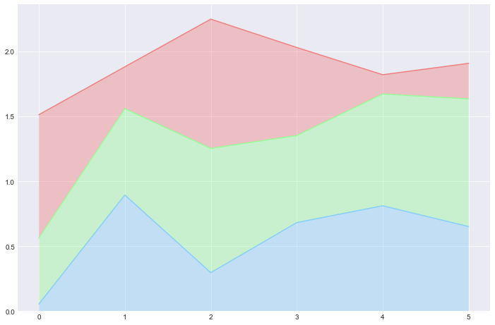
Compared to the Line Plot, the Stacked Area Plot:
but also
Hence, we should consider both the plots and select the best-fitted one for each specific task and dataset.
References: