
Hi everyone,
This is my 4th blog on a series of data visualization with charts for specific purposes. I hope you enjoy this post!
For today’s discussion, the spotlight is on:
First, let’s, as usual, import our beautiful libraries.
import numpy as np
import pandas as pd
import scipy as sp
import matplotlib
from matplotlib import pyplot as plt
import seaborn as sns
And we can (optionally) set some default parameters for our plots. I usually define the figure size and style as below.
# set default figure-size
matplotlib.rcParams['figure.figsize'] = (12, 8)
# set default style
plt.style.use('seaborn-darkgrid')
In case you want to select another style, you can see a list by running the below command.
print(plt.style.available)
Scatter Plot
Here comes the famous one: Scatter Plot.
It is inarguable that Scatter Plots are used very very frequently, as they are so useful! If there is no Scatter Plot in an Explanatory Data Analysis thread, that would be strange. Hence, it would be a big loss if we do not know how to use them.
Let’s get started.
# Data to plot
iris = datasets.load_iris()
iris_df = pd.DataFrame(iris.data, columns=iris.feature_names)
iris_df['iris-type'] = iris.target
iris_df['iris-type'] = iris_df['iris-type'].apply(lambda i : iris.target_names[i])

# Draw a scatter-plot
sns.set(font_scale=1.5)
fig, ax = plt.subplots()
sns.scatterplot(data=iris_df, \
                x='petal length (cm)',
                y='petal width (cm)', \
                hue='iris-type', \
                style='iris-type', \
                size='iris-type', \
                sizes=(40, 400)
               )
plt.legend(fontsize='20')
plt.show()
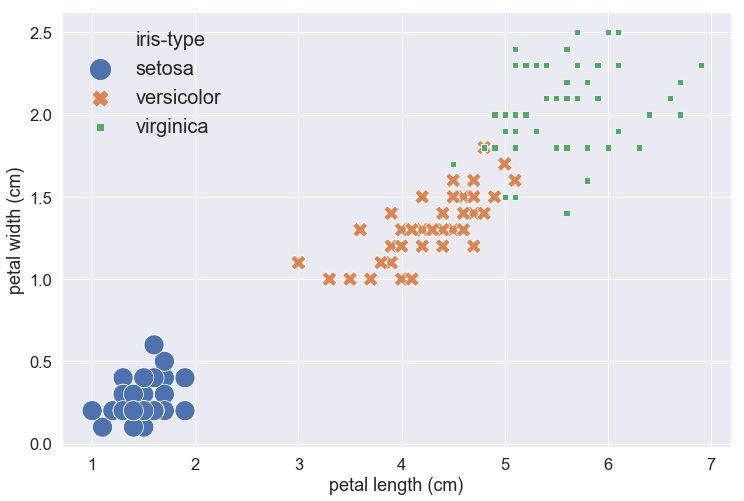
Parameter explanation:
- font_scale: to scale the size of every text showed on the plot, like the x-axis and y-axis labels and tickers.
- data: a DataFrame that contains data to be plotted.
- x: the column-name of data to show in the x-axis.
- y: the column-name of data to show in the y-axis.
- hue: the column-name of a categorical variable, samples with different values will be represented by markers with different colors.
- style: the column-name of a categorical variable, samples with different values will be represented by markers with different shapes.
- size: the column-name of a categorical variable, samples with different values will be represented by markers with different sizes.
- sizes: the actual lower-bound and upper-bound of different sizes.
Heatmap
Heatmap receives input as a 2-dimensional array of numerical values, and output a 2-dimensional board with each cell on the board is colored according to the corresponding value in the input data. The aim is to utilize our visual system (as we perceive colors better than numbers).
Let us see an example.
# Data to plot
data = np.random.rand(4, 6)
print(data)

# Draw a heat-map
fig, ax = plt.subplots()
sns.heatmap(data)
plt.show()
[[0.5595239  0.01467296 0.14143642 0.76843841 0.70984295 0.97509224]
 [0.23523437 0.96371291 0.45289626 0.048601   0.7858303  0.32245011]
 [0.22061362 0.23264992 0.18685124 0.73685263 0.36852813 0.07096345]
 [0.46675181 0.42372794 0.1970837  0.50127401 0.90475363 0.2592287 ]]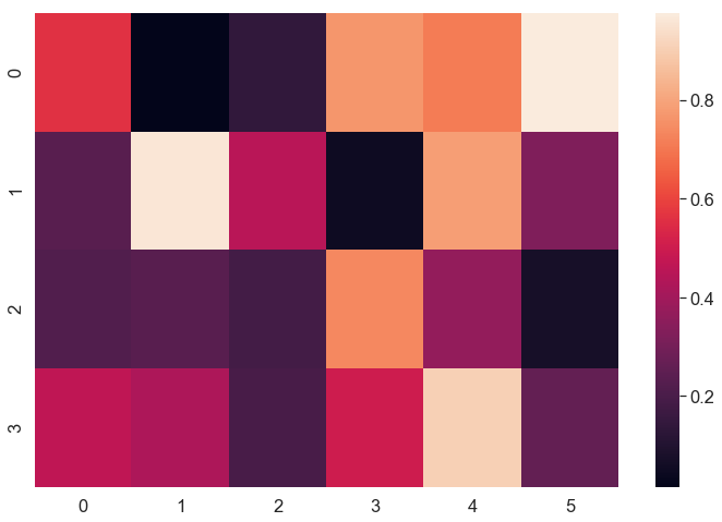
We printed out the values as a 2-dimensional array and plotted a Heatmap.
Imagine we want to find the smallest and the biggest values of the data, looking at the Heatmap will be clearly faster than checking out each value in the numerical array one-by-one.
But Heatmap is not just for finding the big and small values in a random array. In fact, what Heatmap is mostly used for is representing a correlation-matrix. When we examine a dataset, it’s so usual that we want to check the relationship between pairs of variables. The target might be testing for multicollinearity, checking the diversity of the dataset, doing feature selection or finding a predictor that has the closest relationship with our response variable. In those cases, Heatmap is our best friend.
Let’s try Heatmap for correlation-matrix on an actual dataset:
# Data to plot
wine = datasets.load_wine()
wine_df = pd.DataFrame(wine.data, columns=wine.feature_names)
wine_df['wine-type'] = wine.target
data = wine_df[['alcohol', 'ash', 'hue', 'wine-type']].corr() # take the corr-matrix of 4 columns
sns.heatmap(data=data, \
            square=True, \
            vmin=-1, \
            vmax=1, \
            annot=True, \
            fmt='.1%', \
            cmap='coolwarm'
           )
plt.show()
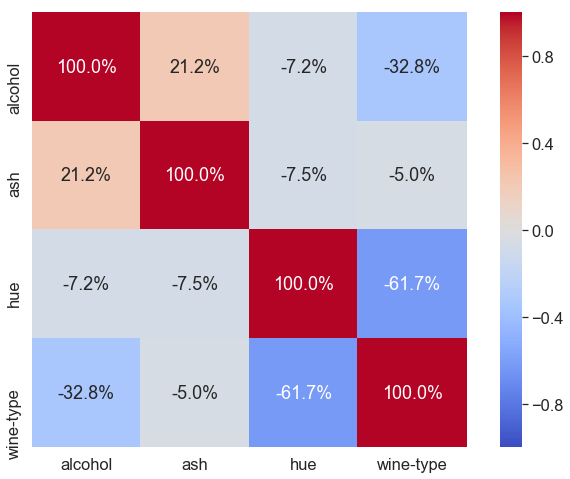
Here, we load dataset wine, take 4 columns from it, get correlation-matrix of these 4 columns, and then plot a Heatmap.
Parameter explanation:
- data: a 2-dimensional array – the correlation-matrix.
- square: set to True to have each cell being a square. Otherwise, cells may be rectangles, depending on the figure’s shape.
- vmin, vmax: the min and max of the color bar. Here, correlation is in the range from -1 to 1, inclusively.
- annot: set to True because we want to have the value in the center of each cell.
- fmt: format of the annotation, if annot==True.
- cmap: specify the gradient of the color bar.
References: