The ROC curve is an often-used performance metric for classification problems. In this article, we attempt to familiarize ourselves with this evaluation method from scratch, beginning with what a curve means, the definition of the ROC curve to the Area Under the ROC curve (AUC), and finally, its variants.
The Curve
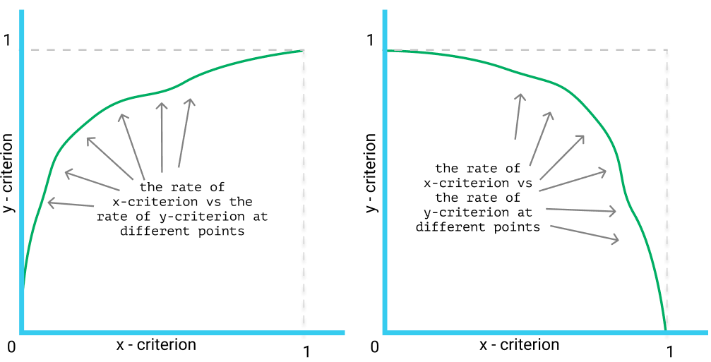
In the scope of classification performance measurement, a curve is a line graph showing how a model performs at varied thresholds.
Being a line graph, it is composed of 2 axes and, of course, a line running in-between. The 2 axes usually represent some of the simple ratios taken from the confusion matrix (e.g. Precision, Recall, and False-Positive Rate), while the line is plotted by stitching different points together.
For simplicity, we only examine the use of curves when working with binary labels. In the cases of multi-class classification, a curve should be made for each individual label.
Example prototypes of curves for performance evaluation.
Note that:
The curves should only be drawn if the output of the model is a score or ranking. If the predictions are either 0 or 1 (Negative or Positive), there is no meaning in drawing a curve since we cannot take different thresholds.
By threshold, we mean the cut point so that all outputs that are smaller than the threshold being interpreted as negative while the outputs that are larger than or equal to the threshold being marked positive. For example, using Logistic Regression, the predicted value of any sample is in the range (0, 1), so we often take 0.5 as the threshold: samples that are predicted with values less than 0.5 are converted to 0 (meaning they are predicted to be Negative), while the others are converted to 1 (meaning Positive). However, we can choose different thresholds, e.g. 0.3, 0.6 or even 0.9. The curves are formed by calculating the x-criterion and y-criterion at these thresholds.
There are many types of curves, in which the most popular ones seem to be the ROC and the Precision-Recall curves. Usually, their difference is only on the selections of which criteria for the 2-axes.
The ROC curve
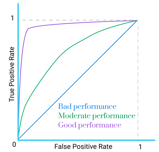
The ROC (Receiver Operating Characteristic) curve is the curve with its 2-axes being the True Positive Rate (TPR) and False Positive Rate (FPR).
Be reminded that:
Example of a ROC curve
A ROC curve always has 2 ends at (0, 0) and (1, 1).
Normally, a curve that is straight (?!) represents a bad model whose output is no better than flipping a coin (50/50).
This is not utterly true, but, in general, the closer a curve gets to the point (0, 1) the better measurement it expresses (the purple one in the figure above).
To draw a ROC curve in Python:
import matplotlib.pyplot as plt
from sklearn.metrics import roc_curve

fpr, tpr, threshold = roc_curve(y_true, y_score)
plt.plot(fpr, tpr)
plt.show()
The Area Under the ROC curve
As comparing models by looking at their curves is quite vague and inefficient, we have to look for another means that should make comparisons more simple and clear. The answer, intuitively, happens to be the area under those curves.
A ROC curve and its corresponding area.
The Area Under the ROC curve (AUC) is a quantitative measurement of model performance. It is a condensed version of the ROC curve itself and is often used for model comparison. An AUC value of 1 implies a perfect model while being close to 0.5 is not so favored.
In another point of view, the AUC equals to the probability that a random Positive sample is ranked higher than a Negative one, as stated in Green M David et al.’s paper in 1966.
In Python, to get the AUC given the predicted and actual labels, we can take the below function from sklearn. For more parameter tuning, refer to its documents.
is a visual interpretation of how a model works. (And we love visualization.)
helps us see the performance on a 2-dimensional space, thus being more comprehensive than just a single measurement (like the Accuracy).
helps us find the most promising threshold by looking at the graph.
is insensitive to the threshold (since we don’t need to set a threshold at all), which gives hands in reducing over-fitting.
is scale-invariant, meaning only the rank of the values is compared, not the absolute magnitude.
is usually not for model performance comparison.
The ROC curve:
ROC means Receiver Operating Characteristic, the name stemmed from the World War II time and has almost nothing to do with the curve’s characteristics now, so it is safe to ignore this name’s meaning.
is insensitive to class-imbalance, which means resampling the positive or negative class does not affect the ROC curve. Note that this may be either an advantage or disadvantage depending on our problem.
cares equally about the Positive and Negative classes. Again, this property may be beneficial or harmful in different situations.
The AUC, as compared to the original ROC curve:
be quantitative and make it plausible to compare models.
the value of AUC depends on regions of the ROC space that we probably do not care about, for example, the space to the far-right where the FPR is too high.
by being a single number, the AUC cannot account for the distribution of the errors, concealing the fact that if the errors are distributed homogeneously or mainly assembled in some specific ranges.
Important note for the ROC curve (and hence also the AUC) that worths pointing out separately is that it is weak if the dataset is highly imbalanced in favor of the Negative samples. These cases are quite common in practice, e.g. cancer detection, spam filtering.
If the proportion of Negative samples is huge, the number of True Negative would also be much larger than False Positive, which make the False Positive Rate unreliable, thus breaking the whole ROC space.
Concentrated ROC (CROC). The ROC curve, and especially the AUC, gives too much attention to the regions such as the extreme right of the graph where the FPR is very high, even though this region is probably not in use in practice. The CROC addresses this issue by supporting to magnify the left-hand side while minimizing the right-hand side of the graph, using an exponential function with parameter . For example, setting transforms FPRs [0.0, 0.5, 1.0] into [0.0, 0.971, 1.0], which in turn, produces a clearer view of the effective FPR area.
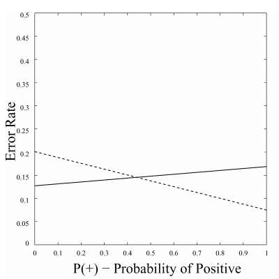
Cost curve (CC). The 2 dimensions of a CC are the probability of Positive (x-axis) and the Error rate (y-axis). For the cases when the distribution of labels in training data is different from the real distribution, or if the real distribution changes over time, we cannot assume the deploying distribution (the distribution of labels when we deploy our model – after training and testing) to be similar to the distribution in training, which makes it hard for evaluating model performance. The CC, by giving out its x-axis for representing the variability of class distribution, assists to handle this problem. For example, look at the CC below, which plots 2 models error rate on varying class distribution. If we can somehow approximate the real distribution around the time we need to give predictions, we are able to choose the better model accordingly.
a Cost Curve showing the performance of 2 different models. The picture was taken from Chris et al.
Note that both CROC and CC are insensitive to class imbalance.


 . For example, setting
  transforms FPRs [0.0, 0.5, 1.0] into [0.0, 0.971, 1.0], which in turn, produces a clearer view of the effective FPR area.