
| Test your knowledge |
|
|
This article attempts to summarize the popular evaluation metrics for binary classification problems. After reading, you will have a comprehensive view of the measurements, including their definitions, strengths, and weaknesses, together with a basic guideline on how to select the right one for each specific situation.
The metrics
Firstly, let’s skim through the evaluation metrics we will be using. Although there are many other measurements proposed by other authors (e.g. Geometric Mean, Discriminant Power, Balanced Accuracy, Lift chart, Matthew’s Correlation Coefficient, Kappa, Kolmogorov Smirnov, and many more), we try to keep the scope of this post on the most prominent ones, as these famous measures are tested and verified by a variety of researchers in the field, which makes it clear about their properties across different types of datasets.
Accuracy
Given its simplicity and apparent intuition, Accuracy is the most commonly reported model evaluation metric.
Accuracy = 
Accuracy represents the proportion of good predictions, ranging from 0 to 1. It is great and succinct when the data labels are approximately balanced, yet is not so useful when the data is imbalanced. A counterexample is when, for example, only 5% of data belongs to the Positive class, a model which predicts all Negative irrespective of the input data will have an Accuracy of 95%, which indicates a very good performance even though the model itself knows nothing about the relationship between predictor variables and the responses.
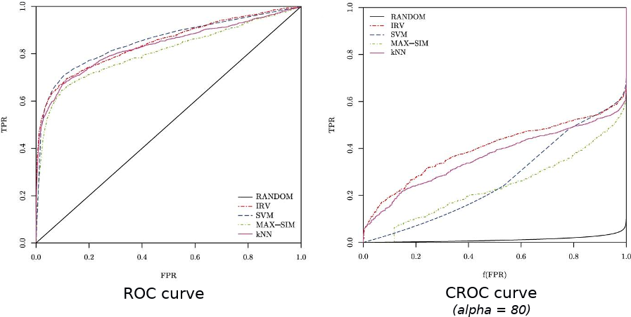
ROC Curve
We have a detailed discussion about the ROC curve here.
Basically, the ROC curve is a line-graph with its 2 axes being the True Positive Rate and the False Positive Rate. ROC curves had been used as a general-purpose metric in many research in the past. However, it, similar to Accuracy, suffers from overfitting in imbalanced datasets.
Area Under the ROC curve (AUC)
AUC is the area of the space formed by the ROC curve, the x-axis, and the y-axis. This area can range from 0 to 1, with 1 means a perfect model, 0.5 is often referred to as the performance of a model that just flips a coin to guess the labels of input data, and 0 shows a model such that by reversing its predictions, we will have a perfect performance.
More information about the AUC can be found in the same post here.
Concentrated ROC curve (CROC)
The CROC is created to fix the ROC’s problem of paying too much attention to the usually-worthless parts of the graph, such as the extreme right where the FPR is excessively high.
This problem is even more severe in the case of Early Retrieval when only the top results are of interest, usually due to limitations of resources. For example, in the case of Cyber Security, we have to rank the many connections to the servers by the degree of suspicion, so that only the top (says, top 10) will be examined and analyzed by the security team to verify whether they are malicious or not.
The CROC, among others, is an example of metrics specifically targeting for Early Retrieval by setting a parameter  that controls how much the area near the origin of the x-axis being magnified. This method is originally proposed by Joshua et al. in this paper.
Cost curve
In its simplest form, the Cost curve is depicted along 2 axes: the Error rate (y-axis) and the Proportion of Positive (x-axis). The aim of this curve is to address the problem of unknown class distribution in the employment environment.
The modification version, or enhanced version, instead uses a Normalized expected cost as the y-axis and Probability cost as the x-axis. It introduces different and adjustable False Positive cost and False Negative cost to the evaluation.
The Probability cost (x-axis) is computed by:

with:
- p(+) is the proportion of Positive samples,
- p(-) = 1 – p(+),
- C(-|+) and C(+|-) are the cost of a False Negative and False Positive respectively.
When misclassification costs are equal, this returns to the original version.
A point in the ROC curve can be represented by a line in the Cost curve, a line in the ROC curve can also be represented by a point in the Cost curve and vice versa. For example, a point (FP, TP) in the ROC space is equal to a line in the Cost space that goes through (0, FP) and (1, 1 – TP). Hence, a ROC curve (which consists of many points) can be transformed into a set of lines in the Cost space as below:
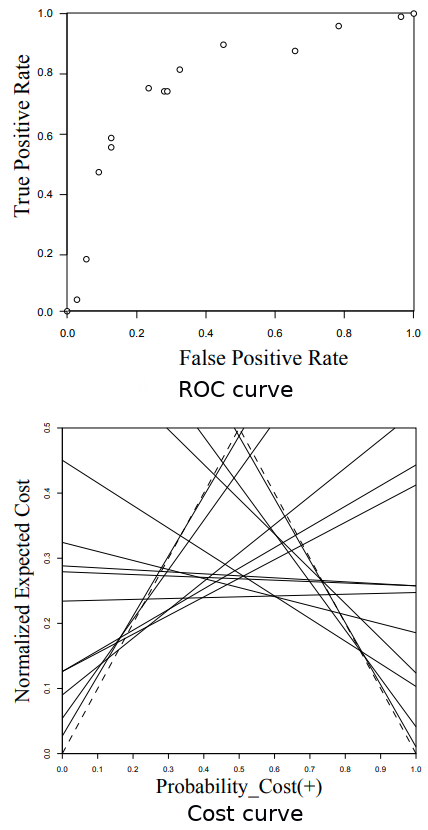
The set of cost-lines above looks a bit intimidated, however, actually, we just need to keep the convex lower bound of this set of lines, which results in a 1-1 transformation from an ROC curve to a Cost curve.
As proposed in this paper, Cost curves have the following advantages over the traditional ROC curves:
F-score
The F-score is a combination of Precision and Recall with weighting being controlled by the parameter  .
.

 means we emphasize Precision more than Recall, while
  shows our preferences for the Recall rate.
A special case is when  , which is called F1-score, or the harmonic mean between Precision and Recall.

The F-score (especially F1-score) is showed to be a very useful metric to deal with imbalanced datasets given its high regard to the Positive class.
Precision-Recall curve (PR-curve)
The Precision-Recall curve also focuses on Precision and Recall, which is the same as F-score, however, being a curve, it is able to model the trade-off in numerous thresholds.
We already had a discussion about the PR-curve here. Furthermore, the extra properties of a curve-shape measure are introduced here.
The Area Under the PR-curve (AUPRC)
The AUPRC is a condensed number representing the PR-curve in a quantitative way. Here, we have to let go of the comprehensive view from curve-shape modeling to achieve a simple and succinct value which helps in model comparison.
Please refer to this post and this post for more details.
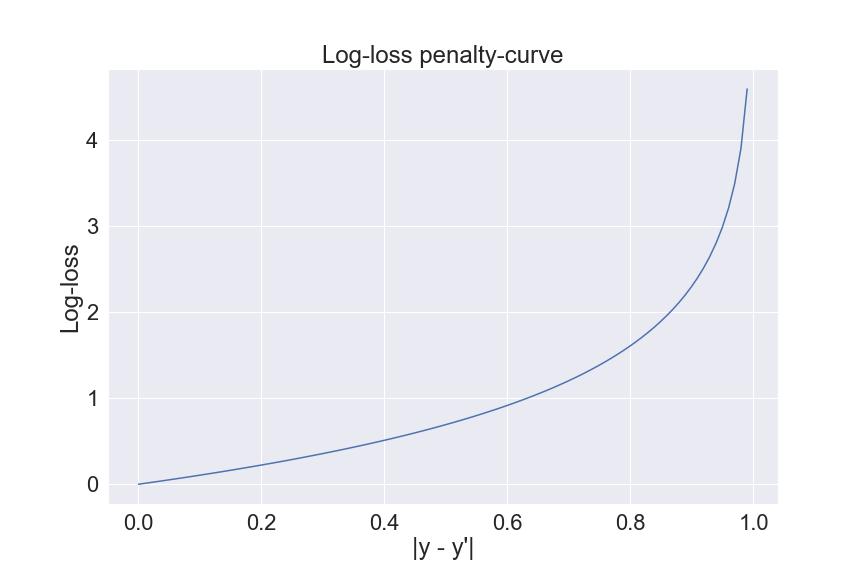
Binary Cross-entropy loss
Cross-entropy loss (or log-loss) is increasingly popular, especially for being a cost function of classification problems.
The formula of Log-loss in binary classification is given by:
Log-loss =  (y*log(y’) + (1-y)*log(1-y’))
where:
- y and y’ are the true label and the predicted label, respectively
- log is the natural logarithm
- n is the data size
Log-loss differentiates itself from the above measurements by computing the cost using the absolute value of predictions instead of relative ranking. This makes it stand out from the crowd.
However, as Log-loss is often used as the cost function, the evaluation function of choice, in those cases, is usually another one. On a side note, the Log-loss is a common cost function because of its ease in differentiation, convexity (Rajesh showed how Log-loss guarantees a convex cost function for Logistic regression here), and of course, good performance in practice.
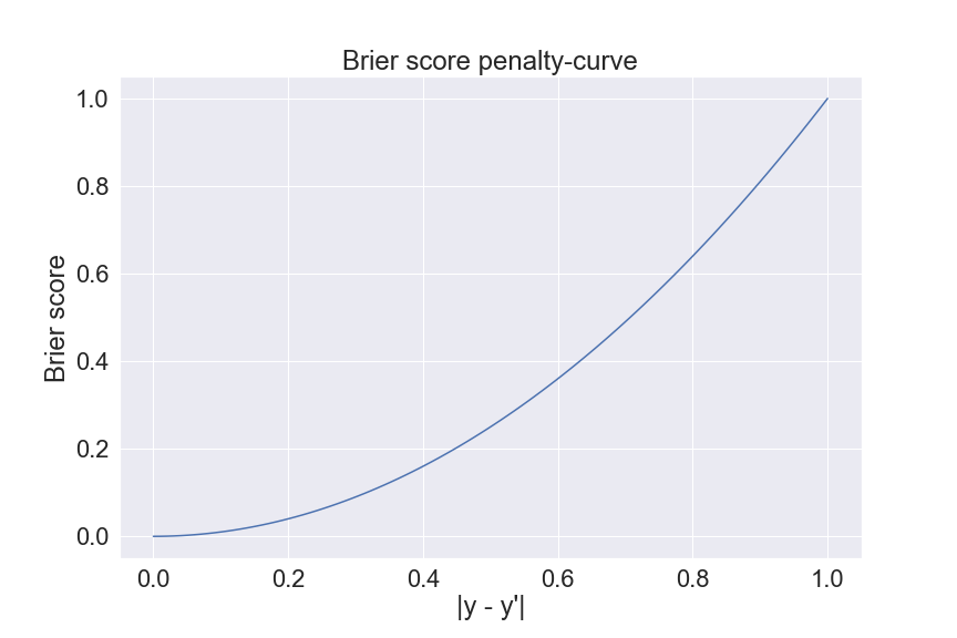
Brier score
The Brier score is just another name for the conventional L2-cost function (or MSE).
Brier score = 
where:
- y and y’ are the true label and the predicted label, respectively
- n is the data size
The Brier score is similar to the Log-loss in the term they both belong to the category of measurements using absolute predictions. Nonetheless, their penalty-curves behave differently. the Brier score punishes the extremely false predictions (for example, a Positive sample that is predicted as 0.001) lesser than the Log-loss.
Evaluation metric selection
To choose the right evaluation metric for a problem is usually not an easy task. The selection should not only depend on the problem itself but also on the preference and the emphasis of the target decision.
First off, it is almost always advisable to look at the Confusion matrix for a quick recap of the predictions. There are only 4 numbers on the matrix, however, it is easy to instantly spot the abnormalities if there are some existing. For example, for an imbalanced dataset, we can quickly recognize that there is a problem with the Precision when the number of TP is much less than the number of FP.
Secondly, it is often that one evaluation metric alone does not give us enough information we need for a problem. Hence, it is beneficial to try out some measures to have views from different points.
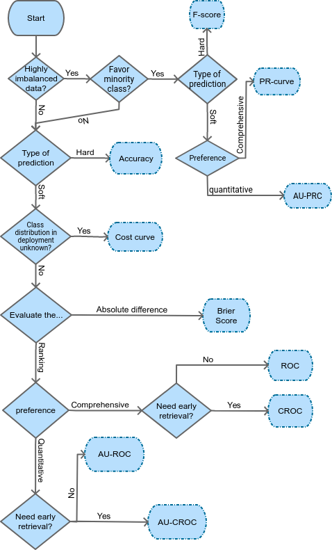
Below, we introduce a general flow-chart to help pick the suitable measurement based on different conditions and preferences. Nonetheless, this supposes to act as a mere reference, but not a must-follow protocol nor a complete guideline.
| Test your understanding |
|
|
References:
- Predictive Accuracy: A Misleading Performance Measure for Highly Imbalanced Data by Josephine et al.: link
- A CROC stronger than ROC: measuring, visualizing and optimizing early retrieval by Joshua et al.: link
- Jakub’s post on evaluation metrics for binary classification: link
- Cost-Sensitive Classifier Evaluation, by Robert et al.: link